

Apple’s new Liquid Glass design language—debuted at WWDC 2025 and now live in the iOS 26 developer beta—marks a dramatic shift in how iPhones look and feel. After spending an entire afternoon exploring it on my iPhone 16 Pro, I can confidently say this: I don’t hate it. But I’m not in love yet either. This design, like molten glass itself, still needs time to cool and settle.
This isn’t just a UI update—it’s a complete visual reimagining of how the iOS system presents itself. Everything from app icons and tab bars to the magnifier that appears when you highlight text now has a glass-like, translucent, almost fluid feel. It’s eye-catching, futuristic, and, at times, overwhelming.
Everything Looks Like It’s Floating in Digital Glass
When Apple described the new look as “Liquid Glass,” it wasn’t exaggerating. From the moment I unlocked my phone, I was met with shimmering UI elements that seem to float above the wallpaper. App icons look familiar, but their softened shadows, bolder colors, and rounded edges feel much more tactile—almost like bubbles resting just above the display.
Even small touches like the text magnifier now appear as transparent domes rather than traditional zoomed rectangles. It’s elegant, but initially jarring. In my grayscale lockscreen setup, which I had just shared for a design-focused newsletter weeks ago, the transformation is immediately apparent. Everything now feels more dynamic, alive, and polished—yet slightly unfamiliar.
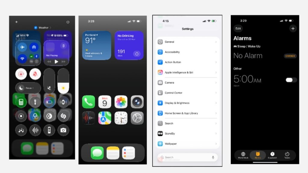
Control Center: Stunning, but Functionality Feels Compromised
One of the biggest visual shifts is in the Control Center, and not necessarily for the better—at least in its current beta form. With the background elements now fully visible through layers of translucent glass, it sometimes feels too busy. Especially for users with vibrant or complex wallpapers, the Control Center may look beautiful but lacks the visual clarity needed for quick glances.
The new sliders and toggles reflect Apple’s obsession with motion design, but the transparency can be a readability challenge. I hope the final version tones down the glass effect slightly or offers custom opacity controls for clarity.
The Clock App Shows Off Liquid Glass at Its Best
Not everything in Liquid Glass feels overwhelming. In fact, some apps showcase the new design beautifully. The Clock app, for example, is a great example of how Liquid Glass can feel functional and delightful.
The bottom navigation bar is now a semi-floating, rounded tab, and the interaction is noticeably different. When you switch tabs, the selector doesn’t just move—it glides, mimicking the movement of a water droplet. You can even press and hold the selector, then drag it across tabs. It’s these kinds of micro-interactions that feel playful and surprisingly satisfying.
Even the alarm toggle button has evolved. It’s no longer a simple round switch. Instead, it’s a longer, pill-shaped button that adds to the softness of the new visual language.
Initial Reactions Are Mixed—But It’s Growing on Me
My first reaction? I kind of hated it. And that shocked me. I’ve always been someone who adapts quickly to UI changes. I embraced iOS 7 when many didn’t. I welcomed iPadOS’s recent layout revamps. But this one caught me off guard.
The scale of change in Liquid Glass is bold—more so than any Apple UI transition in recent memory. The abundance of transparency, reflections, and motion can feel disorienting, especially when you’re used to the strict geometry of iOS 17 and iOS 18.
That said, something interesting happened after just a couple of hours. It started to grow on me.
The gestures are smoother. The home screen animations feel more fluid. And even though there are spacing issues in Settings and some rough transitions in the Control Center, it’s clear that Apple is laying the groundwork for a more immersive, sensorial experience.
Still a Beta: What Apple Needs to Improve Before the Fall Launch
While Liquid Glass is visually stunning, it’s still unfinished. This is, after all, a developer beta. There are a few areas that clearly need polish:
- Settings menus often feel too spaced out or uneven.
- Control Center needs visual simplification for better usability.
- Some transitions stutter or overlap, especially with widgets.
- Text visibility under transparent layers is sometimes poor.
I’m optimistic that Apple will resolve these issues in future beta updates ahead of the public release this fall. Given the company’s track record of refining design over time, we’re likely seeing just the foundation of what Liquid Glass will become.
Liquid Glass Is a Visual Break from Android Lookalikes
Perhaps one of the most important takeaways from this update is that Apple is finally reclaiming its visual identity. For years, iOS and Android skins like Xiaomi’s HyperOS had begun to mirror each other—subtle translucency, rounded corners, shared gestures. But now, with iOS 26, Apple has pulled away decisively.
Liquid Glass doesn’t just look better—it feels unique. And that’s something iOS hasn’t been able to claim in quite some time. It puts visual distance between Apple and Android in a way that feels deliberate, strategic, and distinctly premium.
Final Thoughts: Liquid Glass Is Bold, Beautiful, and Unfinished
Apple’s Liquid Glass UI is a radical reimagining of how software can look and feel. It elevates the iPhone experience from utilitarian to artistic. While it may not be perfect yet, it’s clear that Apple is pushing toward a future where design isn’t just functional—it’s expressive.
So yes, it’s jarring. Yes, it’s occasionally cluttered. But it’s also the most exciting visual shift Apple has made since the flat design revolution a decade ago.
And with a few more months in the kiln, Liquid Glass might just be Apple’s most polished interface yet.